Showing posts with label tutorial. Show all posts

Wednesday, July 6, 2011

Creating Balance - Charm Layout Guide

I'm honestly not sure if people are interested in this aspect of designing charm bracelets, but it's one of the steps that I spend the most time on, so I thought I'd detail it here.  People often tell me that they feel like they cannot arrange items, whether they be charms on a bracelet, or decorative objects in their homes.  I distinctly remember arranging my toys as a child.  I often had just as much fun putting them in just the right place as I did in playing with them. (Yes, I admit I was an odd kid.)  When I got everything arranged "correctly", it was like I had figured out the solution to a puzzle I hadn't even realized I was trying to complete.  As I got older my mom would ask me to arrange pictures on the mantle, and was always far happier with my results than her own.  So I suppose I've always just had a knack for creating a layout.

Once I've gathered all the components for a bracelet, I usually spent an hour or more getting the layout of the charms just right before I actually start building.  Here's a step by step of that process.

I start out by dividing the charms up into groups or pairs that are similarly sizes and shaped.  If they are very odd sizes and shapes, then I try to pick out which items have a similar mass to them.  If I have an uneven number of charms (which is usually my preference) then I pick out one object to be the center of the bracelet.  In this instance I chose the sun to be in the middle.  This was for both aesthetic and catagorical reasons, as well as an intuitive need to support the story.  I liked the idea of the sun being the center of the bracelet, the same way it is the center of the solar system.  It is something that the character of Amy misses seeing in Across the Universe.  She's now found herself trapped on a space ship, with no chance of ever standing under the warming rays of the sun again.  I know in her place (despite my Irish propensity for sun burning) that is what I would be most aware of every day on the ship, that the light above was really just a lamp, and not the sun. 
For arguments sake, if I had paired the sun up with any of the other charms pictured, it would have been with the Earth and undefined planet in the bottom right corner.  All are round, and all are celestial bodies.  As such, I would have tried to divide the three up evenly.  In doing so, I would have placed the sun in the center, and the planets on each side of it, not only because planets revolve around the sun, but because out of those three, the sun is the object which is the most different in shape and texture from the other two.

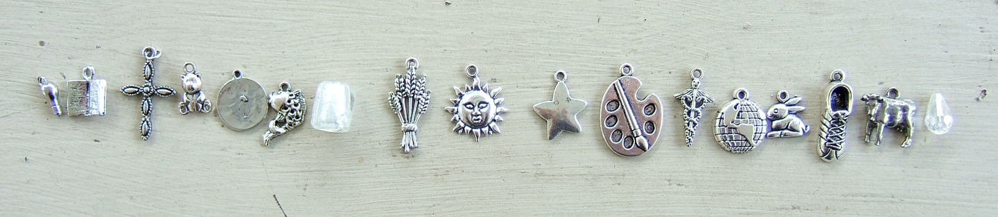
From this point, I start trying to lay out the charms around the center object, attempting to balance both sides of the bracelet.  Not only in visual weight of the charms, but also in other ways, like the type of objects they represent (animals, planets, etc), and other qualities like their color and shine (some of these charms have a higher shine than others, which are antiqued.).  If I ended up with all the animals on one side and all the planets and stars on the other side, the entire bracelet would feel divided.  In this photo I have chosen the first category of charms that I wish to distribute, the largest charms.  The cross, sheaf of wheat, paint palette and running shoe are all bigger than the rest of the charms, so they should be kept apart from one another and spread evenly across the bracelet.  Notice that none of them are really the same shape.  The cross is spindly, the palette is flat and oval.  The shoe is narrow but thick, and the wheat is broad and flat.   
In this case the best balance for the cross is the palette, and for the wheat is the shoe.  The arms of the cross help fool the eye into equating it with the wider palette, and the wrapped bundle of wheat is closer in shape to the narrow shoe.

Now that I've got my larger objects out of the way, it's time to take care of the smallest ones.  In this case the light bulb and the crystal tear drop.  While the tear drop is bigger, it is also clear, unlike the bulb which is smaller but opaque.  This, coupled with the fact that both are tear drop shaped even though their tops are at opposite sides, makes them a great match.
I like to always use my two smallest charms at the ends of my bracelet for aesthetic reasons.  At the end of the bracelet, you have the clasp, which is much narrower than the width of the rest of the bracelet, full of bead pins and charms.  This visual change can be jarring, and make the clasp end look sparse or unfinished.  By placing the shortest charms (and later shortest bead pins) there, your eye is drawn along a more gradual slope. 
The other set of charms I chose to take next was the Earth and the unknown planet (Centauri-Earth in the novel).  I wanted visual distance between the two objects, not only because they look alike, but because of the very great distance between them in the book.  They are 300 years apart, and those who set fourth from one, will never live to see the other.  This gives us a journey to follow, and so it makes sense for that journey to be represented in the bracelet by their distance apart.

Now it's time to start adding in the more medium sized charms, remembering to balance them on both sides in size, shape, and type of object.  I've paired up the book and the cow because they are both basically rectangular in shape and relatively flat and broad.  They are also not very tall, but still taller than the small charms, making them a great transition from the small charms on the end to the bigger charms in the middle of the bracelet.  I've also added in the koi fish and the caduceus (medical symbol), which have a similar size to one another, and also a similar bumpy texture, and darker coloring. I am also attempting to keep the koi a little apart from the paint palette, as they both have something to do with the character of Harley.  Again, spreading things out helps create balance.
Now we are going to start having a trickier time balancing.  I've paired up the teddy bear and the rabbit, due to their size, and the fact that they are both decidedly fuzzy and gentle objects.   Next we have the glass cube bead.  This is an instance when a charm just could not be found for a theme or person I wanted included.  Its purpose is to represent Amy's parents who are still cryogenically frozen in blocks of ice in the bottom of the ship.  Amy is young enough to still want her parents to come rescue her, but old enough to know that isn't possible, and so she dwells on the ice in her longing for their comfort.  I made sure to use the ice bead on the opposite side from the water droplet, and balanced it with a rather shiny star.
This time I've added in the flower beside the book on the left and the infinity symbol beside the cow on the right.  Even though I had the flower and infinity symbol paired up originally, as I placed them I decided that the shine of the infinity symbol better matched the shine on the book, and the texture of the flower and cow were better balanced. 
At this point I try to go back and look at what has already been placed, and make sure I'm still happy with it.  Sometimes I'm not, and have to rearrange items that were originally anchor points in the design.  In this case, I just didn't feel like the 4 large charms were in the right order.

I've now rearranged the large charms.  The wheat stayed in place, but the cross, shoe and palette were all swapped about.  I cannot give you an absolute logical reason for this choice.  It is simply where the objects felt right.  Remember, the use of size, shape, color, texture and mass (the elements of design), are all a great guide to laying things out, but if it were as simple as following a formula, there would be no art to it.  By rearranging items until they feel right to you, you are putting something of yourself in the work and that will make all the difference.
Finished layout for the Across the Universe bracelet.

Monday, May 2, 2011

Doctor Who Reverse Stencil Tote - with Mini-Tutorial

I recently Angeled in Round 5 of the Doctor Who Swap.  Since my partner had already waited so long for a package, only to be flaked on, I wanted to make her Angel package as quickly as possible, but with maximum adorability.  I decided to make her a stenciled tote bag with the TARDIS traveling through the Vortex on it. Instead of stenciling the TARDIS itself onto the bag in blue paint, I decided to instead get a blue tote bag and stencil & paint AROUND the TARDIS.  Here's a mini-tutorial of how I did it.
Start by finding a stencil shape that you like.  You will want to make sure that it has some details to cut from inside it to give the image some definition, and that it has a clearly defined outline.  I cannot seem to find the source for the exact stencil I used, but if I do, I will add a link here.

Next you will need a sturdy canvas tote.  I found this one at Hobby Lobby for just a few dollars.  They come folded up, so be sure to give it a good press with your iron, and don't be afraid to use some steam.  You really need to flatten out those fold lines or you won't get your stencil to stick as well as you would like.  Also, don't be afraid to iron it a few times, letting it sit for a few moments between pressings.  Wrinkles and fold lines in cotton can be tricky!  If you really can't get them out, then try this trick used by costumers:  Put equal parts distilled white vinegar and water in a small spray bottle, and give it a shake.  Spritz onto your problem wrinkles, then iron.  The vinegar helps relax the fibers, allowing them to press flat.  As for the vinegar smell, don't worry.  It will fade and disappear in no time.  Allow the bag to sit a few minutes to cool and dry out from any vinegar and steam.
 Figure out where you would like your TARDIS (or any other object you wish to stencil!) to be.  Be sure to remember that when you fill the tote bag with stuff, the bottom will be bulging, so those bottom few inches of fabric will actually be on the bottom of the bag, rather than the sides!
 Once you have your placement, go ahead and iron down your stencil.  Make sure to get into all the tiny corners and edges.  If they are not ironed down securely then you will have color bleeding around your image.

Now we're ready to do our first color of paint.  I chose to start with the windows and the light spilling out from the open door.  Give them a coat of white fabric paint.  If you don't have fabric paint, you can use craft paint, mixed with Fabric Medium.  (Which is found near craft paint in your local craft store.  Mix according to package directions.)  Depending on how dark your base fabric is, you may need to give lighter colors of paint more than one coat for good coverage.

Second color of paint!  Instead of a stark black, I chose to go with a very dark purple-black for the recessed areas of the TARDIS, as well as the Police Box sign.  With darker colors you generally only need one or two coats of paint for nice even coverage.
Now, while you've got the dark purple paint out, let's start the shadowy parts of the Vortex.  Use a piece of natural sea sponge to get irregular and organic shapes.  You may need to test this out a few times, and blot some of the excess paint off of your sponge before moving onto the fabric.  I recommend testing it on some brown paper.  I went with concentric circles of color, to show the twisting and turning of the Vortex, and left some space blank.
During all of this, be sure to be careful not to drip paint onto the white areas of your stencil!

Next, it's time to add some highlight to the Vortex.  I mixed up a light blue paint, and again added concentric rings, filling in the space I left last time.I went light on this coat, so that I could add in some metallic paint in the next step.
To give the tote more dimension and depth, I added a layer of metallic silver.  Instead of using a metallic paint however, I used the same light blue highlight paint, and added in Jacquard PearlEx Metallic Powder.  Go lightly over the highlighted areas, and blend some gently into the darker shadowy areas as well.  You want the colors to be layered and blended, not sitting in neat rows beside one another.
After a first light coat of silver paint, give it a few minutes to dry.  When the shine of the wet paint begins to dry, you will be able to see just how much of your metallic pigment is visible.  After letting it dry for a little while, be sure to turn the project, as the silver can look more or less heavy depending on how it catches the light.  If necessary, add another coat of metallic pigments.  Remember, you can always do a second coat, but you can't take off a coat that was too heavily applied.
Check back once you think you are done, and note any areas that might need touching up.  Once you are happy with your paint job, go ahead and let it dry completely.  After it is dry you can peel back the stencil.  It will likely rip into pieces, and this is normal.  You will not be able to re-use the freezer paper stencil.
Now, stand back and admire your new tote bag!

Saturday, February 26, 2011

Laminated Paper Bookmarks Tutorial & Template

I am currently organizing a giant Bookmark Swap over on Craftster, and there are so many fun bookmarks popping up in our gallery.  I had a great time making individual designs for each of my partners.  Themes included Harry Potter, Doctor Who, and Outlander.  Sadly, I forgot to get pictures of all of them before I sent them.  I'll try to post the pictures that were put up by my partners.


In the mean time, a couple people in the swap asked for a tutorial on how I made my bookmarks.  And since a tutorial isn't much help without the corresponding pattern pieces, here goes the tutorial and a free template!


Ingredients:
Golden Snitch & Sonic Screwdriver Template (GS & SS refer to which bookmark each supply is used in)
gold metallic paper/cardstock (GS)
silver metallic paper/cardstock (GS & SS)
blue paper (SS)
grey granite/crackled looking paper (SS)
rubber cement or archival safe glue (GS & SS)
see-thru ruler with 1/8" marks (GS)
fine point Sharpie (GS)
black colored pencil for shading (GS & SS)
gold leaf or a gold paint pen (GS)
laminator  (GS & SS)

Print out the bookmark templates, preferably on cardstock.  Cut out the desired pieces and trace them onto the corresponding paper colors listed on the template.  


**Where ever possible, I would recommend using metallic paper rather than cardstock.  The reason for this comes in during the laminating process.  If they finished bookmarks are too thick the laminator can't seal all the way around them, leaving small gaps in the plastic.  I helped allieviate this by running mine through the laminator twice and cutting with a wide edge of plastic all the way around, but making them thinner would avoid this problem all together.**
Now let's put them together! 

Let's start with the Sonic Screwdriver bookmark first.  
Cut out all your pieces.  Before we go any further, see those two "T" shaped pieces?  You won't need them.  Go ahead and toss them now.  My bad.
Now, let's start with the screwdriver's handle.  Take the blue rectangle and the grey handle piece that has a long thin oval cut out of it.  Working from the side with the pencil lines on it, glue the blue down so that it fills the long oval window.  Trim off any excess paper with your Exacto knife if necessary.
Flip the handle piece over and glue it to the silver body of the screwdriver, matching the grooved shapes at the front of the handle. 
Next, take your knife and trim away any excess bits of paper visible from the other side of the bookmark.  We will be doing this step after we add on each of the next few pieces.
Place your blue circle at behind the end of the screwdriver, till you find how much of the circle you'd like to have showing.  Lightly draw along the silver edge on the blue paper.  Leaving a scant 1/8" beyond that line for gluing, cut away the extra part of the circle. Apply a very small amount of glue to the end of the blue circle, and attach it from the back, to the silver body of the screwdriver.
Go ahead and glue on the tips of the screwdriver.  One to the front and one to the back.  Again, trimming away excess paper with your craft knife between each step.  
Now our screwdrivers need some definition.  Take a pencil and a small ruler, and begin drawing straight lines between all the body segments.  Go over these with a fine point Sharpie. 
After you get the main lines sketched out, you can go back with your colored pencil, and add some more shadow to give the bookmark more dimensionality.  I colored every other segment in, and used rounded shadows on the other areas.  I also dragged my colored pencil along all the sides of the bookmark, both to give definition, and to hide the very boring looking cut edges.  Don't forget to shade around the blue window!
Step back and take a look at your screwdriver.  Give it any last minute shading or definition that you wish.  
Finally, using your exacto knife, cut out the last little windows at the back end of the screwdriver, and sketch around them with your black pencil.  Sadly, I forgot to get a picture of this step.  Scroll down to see the finished and laminated bookmarks, where the back end cutouts are visible.  


Now let's make the Golden Snitch!  
Start by cutting out your pieces.  One body, and 2 circles for the front & back.
Let's give the wings some definition.  Start by sketching a "vein" along the top and down the inside edge of the wing with pencil. I just free handed these.  Once you have a shape you like, go over it in Sharpie, and erase any unnecessary pencil lines.  Now, take a small see-through ruler, and starting at the wide end of the wing, make hatch marks every 1/8" to the end of the wing, stopping just before the very bottom edge.  Now that your wing has definition, it needs some shading.  I shaded just under the top of the wing, and slightly along the sides, with a black colored pencil. 
Repeat on the other wing.
Next apply glue to one of the gold circles.  Attach it to the silver body of the snitch, being careful to line up your circles.
Flip it over and trim away any excess with your craft knife.
I chose to make my Snitch a bit fancy by applying some gold leaf.  I used a gold leafing pen that I found at Hobby Lobby.  You simply draw with the adhesive pen, (much like a paint pen), then let it sit for 5 minutes to get tacky.  Once the glue is ready, you apply your gold leaf.  When you pull the backing paper away, you will have a messy blob of gold leaf stuck to your Snitch.
Not to worry!  Gently brush off any excess with a soft paint brush.
It should now look something like this:
After the gold leaf is applied, glue the Snitch top onto the body, centering your designs as necessary.  Now for the laminating!  (My apologies, I missed getting a picture at this point.  Though it looks exactly like the picture below.)


***Update:  I've also been asked about the plain bookmarks, and what I use to create them.  I've had an old Daniel Merriam calendar laying around since 2008, that was just to pretty to throw away.  Instead, I take the images, coat the back with a good coat of rubber cement, and plop them down on the smoother side of a piece of cardstock in a corresponding color.  (Note, rubber cement works MUCH better than archival glue in this instance!) 
When they are dry, I slice them up on my paper cutter into various bookmark sizes.  Usually about 2" x 8", though I do make some bigger and smaller depending on the image I'm cutting up.  At this point the bookmarks can be used as is.  The rubber cement keeps them together rather well.  I have a few I've been using at least 2 years and there is no separating between the layers.  If desired, pop a hole in the top and thread some scraps of ribbon or yarn through them like this one.***


Let's Laminate!
Plug in and turn on your laminator.  Mine takes a while to heat up, so while it's working, you can start arranging your new bookmarks in a laminating pouch.  I usually get 4-5 in each 81/2" x 11" pouch.
Once it's all warmed up, go ahead and feed your sheet of bookmarks through it.  Take care to feed them nice and evenly so that they don't end up in a jam.
Once they have cooled down, cut out your new bookmarks.  Make sure to round off any corners, so they don't poke or scratch you next time you cuddle up with your favorite book!
If you don't own a laminator, you have a few options.  #1, You can buy one.  They aren't expensive and come in really handy.  Mine was $19 at Aldi.  #2, You can take your bookmarks to Kinko's, Office Max, Staples, etc., and they will be happy to laminate them for you.  It is also not very expensive.  About $1-2 per 8 1/2"x11" sheet.  Or, #3, You can get a similar effect by using packing tape, though it is less sturdy.  I like the "HD" Packing Tape that is made by Duck.  It is SUPER clear, without any of that grime you find on regular packing tape.  (I have used it to great success in making resin-filled bottle cap pendants as well and you can't even tell it's there.)  I found rolls Walmart for a few dollars.

Saturday, November 27, 2010

Ice Mice Tutorial for the Harry Potter and the Deathly Hallows Premier

My lack of updating has been due mostly to the fact that I'm teaching a history class, on top of my full time job this semester.  As a result, I've had virtually no time for crafting, and even had to stop doing craft swaps.  I did make an exception however in order to host a Decked Out for Deathly Hallows Swap over on Craftster.  The idea of the swap was to prepare for going to see the Premier.  Participants were required to make 1 wearable item to wear to the film, 1 edible item to eat while watching the movie, and one toy, game or accessory to play with while waiting in line.

I organized the swap with my friends Grace and Melissa, and Grace and I even made all our candies together.  We made mountains of treats, including from top to bottom:
Raspberry Almond Marshmallows
Peanut Butter Gryffindors with Truffle Centers
Chocoballs (Bourbon Balls)
Dr. Beanpole's Skelle-grow Vita Charms
Chocolate Frogs
Ice Mice
Ginger Stars
Dark Chocolate Rasberry Truffles & Raspberry Creams
Dark Chocolate Wands


Today I'm going to post my tutorial for making Ice Mice.

Ingredients:
Almond Bark or White Chocolate Candy Melts, available at grocery or craft stores
Peppermint Candy Oil (I used Lorann Gourmet)
Blue Candy Coloring (note, you CANNOT use regular food coloring here)
Buttercream Candy Filling (I picked up the Make & Mold variety at Hobby Lobby)

Clean (New) Nylon paintbrush
Mouse Candy Mold (I got mine from Cake and Candy on Ebay)
various toothpicks, spoons & stirrers
a small bowl
microwave safe container for melting candy
cutting board & a sharp chef's knife

Begin by clearing a clean work surface.  Open up your package of almond bark or candy melts.  If using almond bark, break off a few squares of the candy, and then chop them into small chunks.  (Somewhat smaller than Hershey's kisses, and larger than chocolate chips.)


Place the candy in a microwave safe dish, and begin microwaving for 30 seconds.  Stir.  It will still be rather solid.  Continue for another 30 seconds.  Stir.  You should see it begining to melt.  Continue microwaving and stirring for 20 second bursts of time.  As it is nearly all melted, reduce time to 10 seconds.  Stir until all the candy is smooth.  After the candy is all melted, add a few drops of Peppermint Candy Oil.  This stuff is 4 times more concentrated than flavoring extracts and you will not need a lot.  I went with about 4 drops.  Stir well and taste.   

Take a small amount of the white chocolate, maybe a tablespoon or two, and put it in a smaller bowl.  Dip a toothpick in your candy coloring, and stir into the white chocolate.  You are looking to make a nice light blue, and should only need a little coloring.  Too much and it will change the texture of the candy.  Continue coloring and stirring till you reach the desired color.

Now, take your clean new paintbrush, and dip it in the blue candy coating.  Paint the noses and the tails of the mice mold with the blue chocolate.  Be sure to paint it on thick, especially at the tails.  Allow to set in the fridge for a moment, while you check on your white chocolate, and reheat a few seconds if necessary. 


Pour about 2 Tablespoons of the white chocolate into each mold.


Use a new clean paintbrush to spread the coating around the rest of the mold, being sure to get plenty of candy into the tiny crevices, like the ears.


 Once you think the mold is all set, hold it up to the light, and make sure you don't have any air bubbles or thin spots.  Don't worry about a few stray drips of chocolate on the mold.  We'll fix that later.  Place the mold in the fridge for a few minutes. 
 

 Now that your molds are full of their first round of candy, it's time to prepare the buttercream filling.
 Start with a small amount of the filling in a bowl.  A few Tablespoons at most.  (I used about 1/4 of the package at a time.)  Use a toothpick to add a small amount of the blue candy coloring. 


Stir in the coloring thoroughly.  It may look like a different shade of blue than your chocolate did, because the buttercream has a naturally yellow tone to it.


Add more coloring if necessary to get your desired color.  We are going for a light blue again.  Anything too dark with show through the white chocolate, which would ruin the surprise to come when your friends bite into them.  Once you get a color you like, add a drop or two of the Peppermint Candy Oil.  Stir well and taste.  It should be pepperminty, but not overpowering.


Next, you will be making small logs out of the buttercream to fill your mice.  The buttercream is a little firm on it's own, and we will be using that to our advantage.  Take a small chunk out, about a Tablespoon.  Roll it gently and quickly into a small log.  You don't want to over-handle the buttercream, or it will become too soft and sticky due to your body temperature.

Now look back at your mold.  Will the log you made fit inside one of the mice, with room to cover in a second layer of white chocolate?  Adjust as necessary.


 Place a log of buttercream into each mouse, and use your clean fingers to press the cream into the mold, making it nice and flat, and leaving about 1/4" of room at the top of the mold for more chocolate. 

 Check on your white chocolate, and re-heat if necessary, in 15 second bursts of time.  Stir till smooth.  Top each of the mice with enough white chocolate to fill the remaining space in the mold.  It should be about a Tablespoon or two.  Spread the chocolate evenly with a paintbrush or a stirrer, and make sure not to miss any spots.  Be especially careful to get some more of the white chocolate on top of the blue chocolate tails.  If the tails are too thin, or not properly attached to the bodies, they will break when you remove them from the mold.


 Place your mold in the fridge for about 20 minutes, till the mice set up.  The chocolate should be completely firm to the touch.  If in doubt, hold the mold up to the light again.  If the chocolates have a slightly frosted appearance, and the candy seems to be separate from the mold, they are done.  If they appear to be slightly wet, they are not set up enough.  When they are done, turn the molds upside down over the table or a plate, and pop the mice right out.


Grace and I packaged ours in blue and white airtight containers from the dollar store.  I placed some blue tissue paper in each box, then a small square of wax paper to protect the candies, and to keep the tissue from getting oil spots.  Here's one broken open, to see the filling. 


After mailing tons of treats to our swap partners, Grace and I made some more for the Deathly Hallows Premier party we hosted, and brought the extras to the theatre, where we handed them out to other excited fans.  One girl even made her friends take a picture of her with her Ice Mice and Chocolate Frogs.  It made me so happy to see how much enjoyment everyone got out of our candies.

Enjoy the candy making tutorial, and Harry Potter and the Deathly Hallows Part I.  I can't wait to go see Part II!

P.S.  A special thank you to my swap partner Andromeda007 over at Un-Managed Mischief  and to Grace's partner RippledWater for some of the photographs!