I'm honestly not sure if people are interested in this aspect of designing charm bracelets, but it's one of the steps that I spend the most time on, so I thought I'd detail it here. People often tell me that they feel like they cannot arrange items, whether they be charms on a bracelet, or decorative objects in their homes. I distinctly remember arranging my toys as a child. I often had just as much fun putting them in just the right place as I did in playing with them. (Yes, I admit I was an odd kid.) When I got everything arranged "correctly", it was like I had figured out the solution to a puzzle I hadn't even realized I was trying to complete. As I got older my mom would ask me to arrange pictures on the mantle, and was always far happier with my results than her own. So I suppose I've always just had a knack for creating a layout.
Once I've gathered all the components for a bracelet, I usually spent an hour or more getting the layout of the charms just right before I actually start building. Here's a step by step of that process.

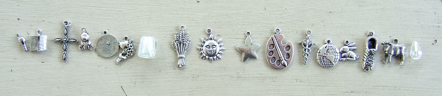
I start out by dividing the charms up into groups or pairs that are similarly sizes and shaped. If they are very odd sizes and shapes, then I try to pick out which items have a similar mass to them. If I have an uneven number of charms (which is usually my preference) then I pick out one object to be the center of the bracelet. In this instance I chose the sun to be in the middle. This was for both aesthetic and catagorical reasons, as well as an intuitive need to support the story. I liked the idea of the sun being the center of the bracelet, the same way it is the center of the solar system. It is something that the character of Amy misses seeing in Across the Universe. She's now found herself trapped on a space ship, with no chance of ever standing under the warming rays of the sun again. I know in her place (despite my Irish propensity for sun burning) that is what I would be most aware of every day on the ship, that the light above was really just a lamp, and not the sun.
For arguments sake, if I had paired the sun up with any of the other charms pictured, it would have been with the Earth and undefined planet in the bottom right corner. All are round, and all are celestial bodies. As such, I would have tried to divide the three up evenly. In doing so, I would have placed the sun in the center, and the planets on each side of it, not only because planets revolve around the sun, but because out of those three, the sun is the object which is the most different in shape and texture from the other two.

From this point, I start trying to lay out the charms around the center object, attempting to balance both sides of the bracelet. Not only in visual weight of the charms, but also in other ways, like the type of objects they represent (animals, planets, etc), and other qualities like their color and shine (some of these charms have a higher shine than others, which are antiqued.). If I ended up with all the animals on one side and all the planets and stars on the other side, the entire bracelet would feel divided. In this photo I have chosen the first category of charms that I wish to distribute, the largest charms. The cross, sheaf of wheat, paint palette and running shoe are all bigger than the rest of the charms, so they should be kept apart from one another and spread evenly across the bracelet. Notice that none of them are really the same shape. The cross is spindly, the palette is flat and oval. The shoe is narrow but thick, and the wheat is broad and flat.
In this case the best balance for the cross is the palette, and for the wheat is the shoe. The arms of the cross help fool the eye into equating it with the wider palette, and the wrapped bundle of wheat is closer in shape to the narrow shoe.
Now that I've got my larger objects out of the way, it's time to take care of the smallest ones. In this case the light bulb and the crystal tear drop. While the tear drop is bigger, it is also clear, unlike the bulb which is smaller but opaque. This, coupled with the fact that both are tear drop shaped even though their tops are at opposite sides, makes them a great match.
I like to always use my two smallest charms at the ends of my bracelet for aesthetic reasons. At the end of the bracelet, you have the clasp, which is much narrower than the width of the rest of the bracelet, full of bead pins and charms. This visual change can be jarring, and make the clasp end look sparse or unfinished. By placing the shortest charms (and later shortest bead pins) there, your eye is drawn along a more gradual slope.
The other set of charms I chose to take next was the Earth and the unknown planet (Centauri-Earth in the novel). I wanted visual distance between the two objects, not only because they look alike, but because of the very great distance between them in the book. They are 300 years apart, and those who set fourth from one, will never live to see the other. This gives us a journey to follow, and so it makes sense for that journey to be represented in the bracelet by their distance apart.

Now it's time to start adding in the more medium sized charms, remembering to balance them on both sides in size, shape, and type of object. I've paired up the book and the cow because they are both basically rectangular in shape and relatively flat and broad. They are also not very tall, but still taller than the small charms, making them a great transition from the small charms on the end to the bigger charms in the middle of the bracelet. I've also added in the koi fish and the caduceus (medical symbol), which have a similar size to one another, and also a similar bumpy texture, and darker coloring. I am also attempting to keep the koi a little apart from the paint palette, as they both have something to do with the character of Harley. Again, spreading things out helps create balance.

Now we are going to start having a trickier time balancing. I've paired up the teddy bear and the rabbit, due to their size, and the fact that they are both decidedly fuzzy and gentle objects. Next we have the glass cube bead. This is an instance when a charm just could not be found for a theme or person I wanted included. Its purpose is to represent Amy's parents who are still cryogenically frozen in blocks of ice in the bottom of the ship. Amy is young enough to still want her parents to come rescue her, but old enough to know that isn't possible, and so she dwells on the ice in her longing for their comfort. I made sure to use the ice bead on the opposite side from the water droplet, and balanced it with a rather shiny star.

This time I've added in the flower beside the book on the left and the infinity symbol beside the cow on the right. Even though I had the flower and infinity symbol paired up originally, as I placed them I decided that the shine of the infinity symbol better matched the shine on the book, and the texture of the flower and cow were better balanced.
At this point I try to go back and look at what has already been placed, and make sure I'm still happy with it. Sometimes I'm not, and have to rearrange items that were originally anchor points in the design. In this case, I just didn't feel like the 4 large charms were in the right order.
I've now rearranged the large charms. The wheat stayed in place, but the cross, shoe and palette were all swapped about. I cannot give you an absolute logical reason for this choice. It is simply where the objects felt right. Remember, the use of size, shape, color, texture and mass (the elements of design), are all a great guide to laying things out, but if it were as simple as following a formula, there would be no art to it. By rearranging items until they feel right to you, you are putting something of yourself in the work and that will make all the difference.
 |
| Finished layout for the Across the Universe bracelet. |


No comments:
Post a Comment